Raul. J

Hat Management System (HMS)
Building an Interface that Helps locate and Manage Employees
Project Type
Work Management Software
Role
UX/UI Designer + UX Research
Industry
Workforce Management / HR Tech
Introduction
🖥️ The Product
The Hat Management System (HMS) is an internal tool for managers and staff to handle employee positions, task assignments, and promotions. The goal of this product is to organize position management, make it easy to view hats (roles), and provide clear info of employees and managers roles and tasks. They also wanted to intergate a new
👥 The Users
Internal team members, and executives/mangers who need transparency over ongoing initiatives, status updates, and performance indicators.
🏆 Business Goals For Product
Increase productivity by giving managers and staff workers that ability to easily view their CSW’s and submit CSW’s and Order forms. We want to close the feedback loop and improve team outcomes by making sure they see the CSW’s and work on them ASAP.
👨💻 What I Worked On
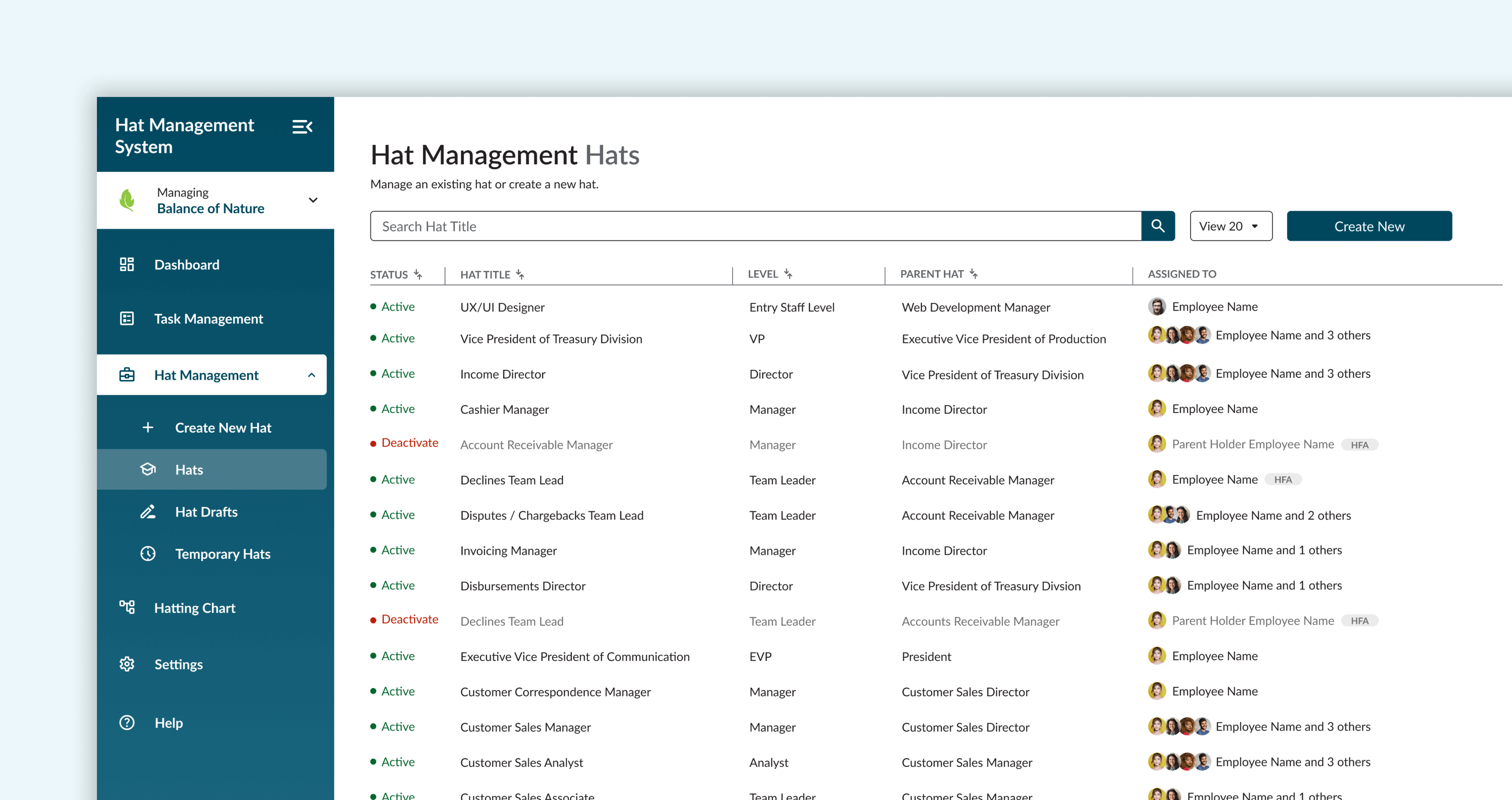
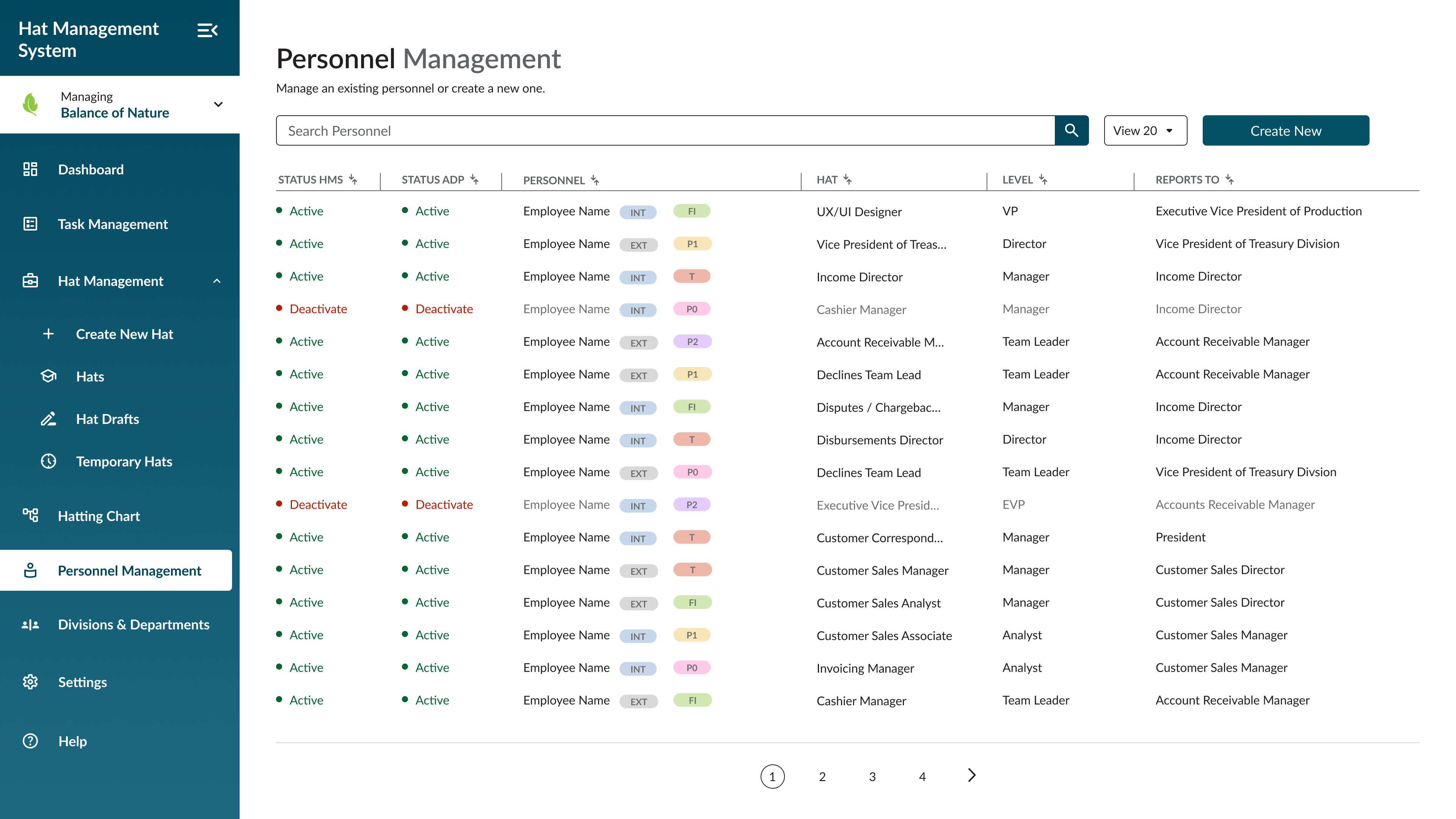
Hat Management Screen: I designed the Hats screen under the Hat Management dropdown. I created an inbox-style layout displaying a list of employees with their assigned hats, status indicators, and priority flags. This layout makes it easy for managers and HR to scan, track, and manage hat assignments efficiently.
Discovery & Research
⁉️ Kickoff Meeting
Since HMS is a brand-new system, our research focused on understanding existing workflows and identifying gaps. Another designer and I were briefed in by the Product Owner and Business Analyst on how the company wanted to manage positions, track all roles, and maintain visibility of each employee’s responsibilities for scenarios like promotions, role changes, or staff departures.
Interviews & Insights
Once we were updated on the business needs we wanted to collect more date from the user. We conducted user interviews across 7 departments to gather qualitative data on pain points and needs.
Key insights:
- Interviews: Managers, HR, and IT staff explained current pain points, including manual tracking, inconsistent access control, and lack of visibility.
- Workflow Analysis: Existing manual processes relied on Google Sheets and emails, causing errors and delays.
- Standards & Frameworks: Hubbard’s Organizing Board principles guided the hierarchy, parent-child relationships, and functions structure.
Key insights:
- Hats define positions, not employees; employees can wear multiple hats.
- Empty hats must be temporarily managed by the parent hat (Held From Above).
- Career paths require clear visualization of levels and expertise.
- Automation is critical for notifications, assignments, and access management.
User Flows and Mapping
To ensure the Hat Management System (HMS) met user needs, we started creating user flows and process maps for all critical tasks with the Business Analyst and the Product Owner. This helped visualize how managers, HR staff, and IT teams would interact with the system and highlighted areas where efficiency could be improved.
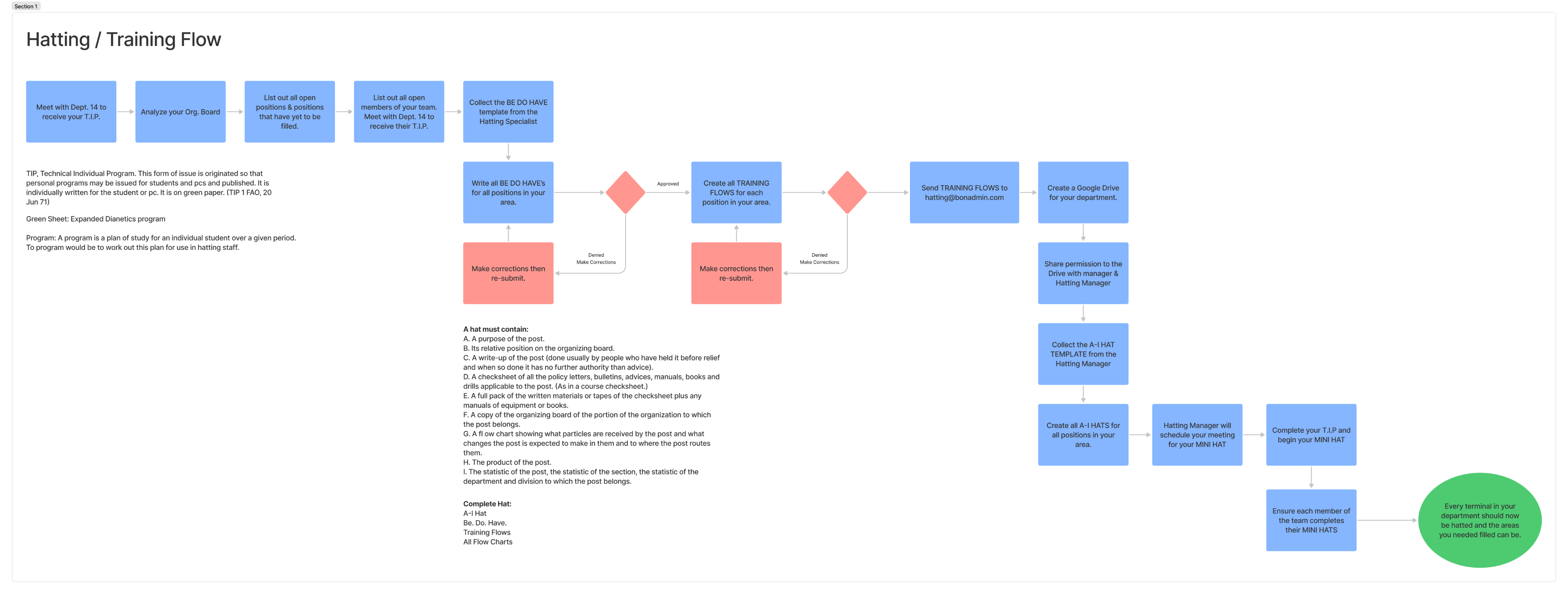
We started by creating a user flow for the hatting system to better understand its process.
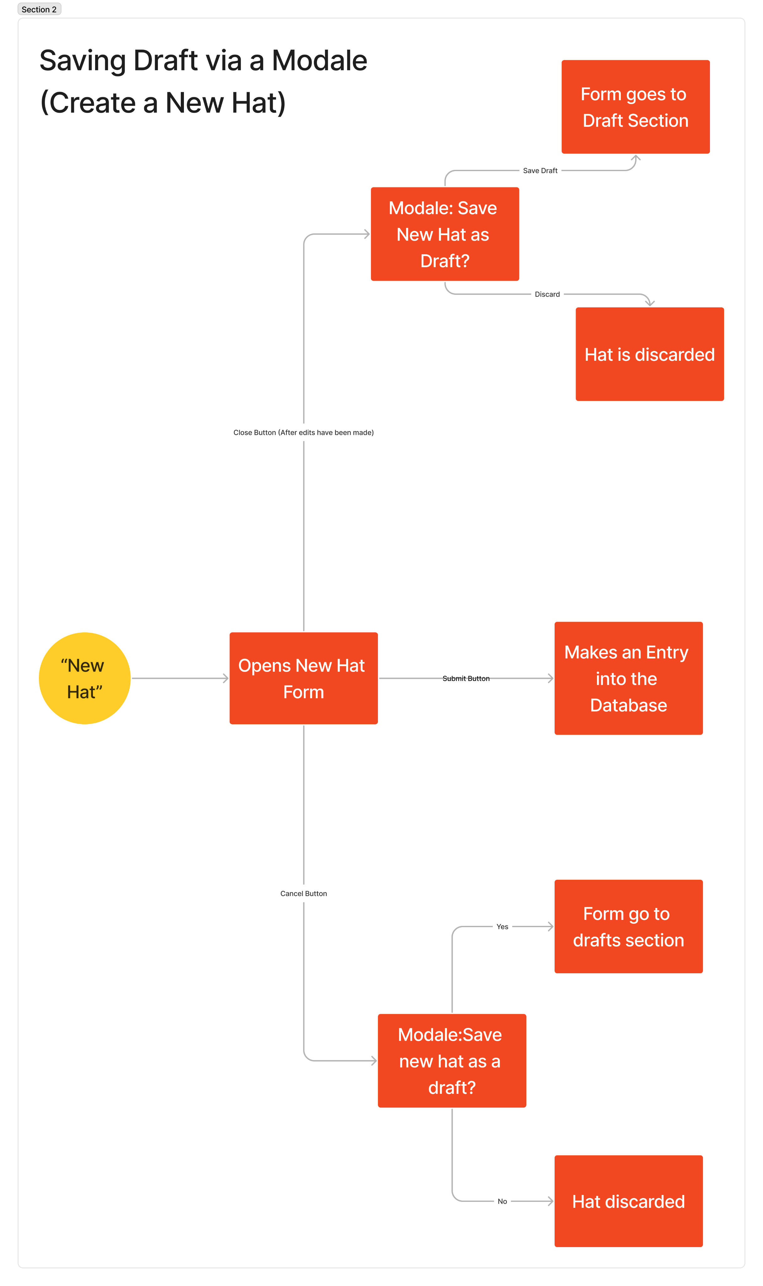
We covered every scenario to ensure there was no confusion during the design process.
Defining The Problem
🤨 What is the problem?
After gathering research and analyzing feedback, one issue kept surfacing. User were losing track of CSW forms, the CSW forms are what are used to approve task and other important stuff. This gap wasn’t just an inconvenience, it was a breakdown that directly affected accountability, project progress, and team morale.
Exploring Solutions
✍️ Sketching and Wireframing
I started by sketching low-fidelity wireframes:
- Hat Management Screen: Inbox-style layout for employees and hats with status, priority, and easy assignment actions.
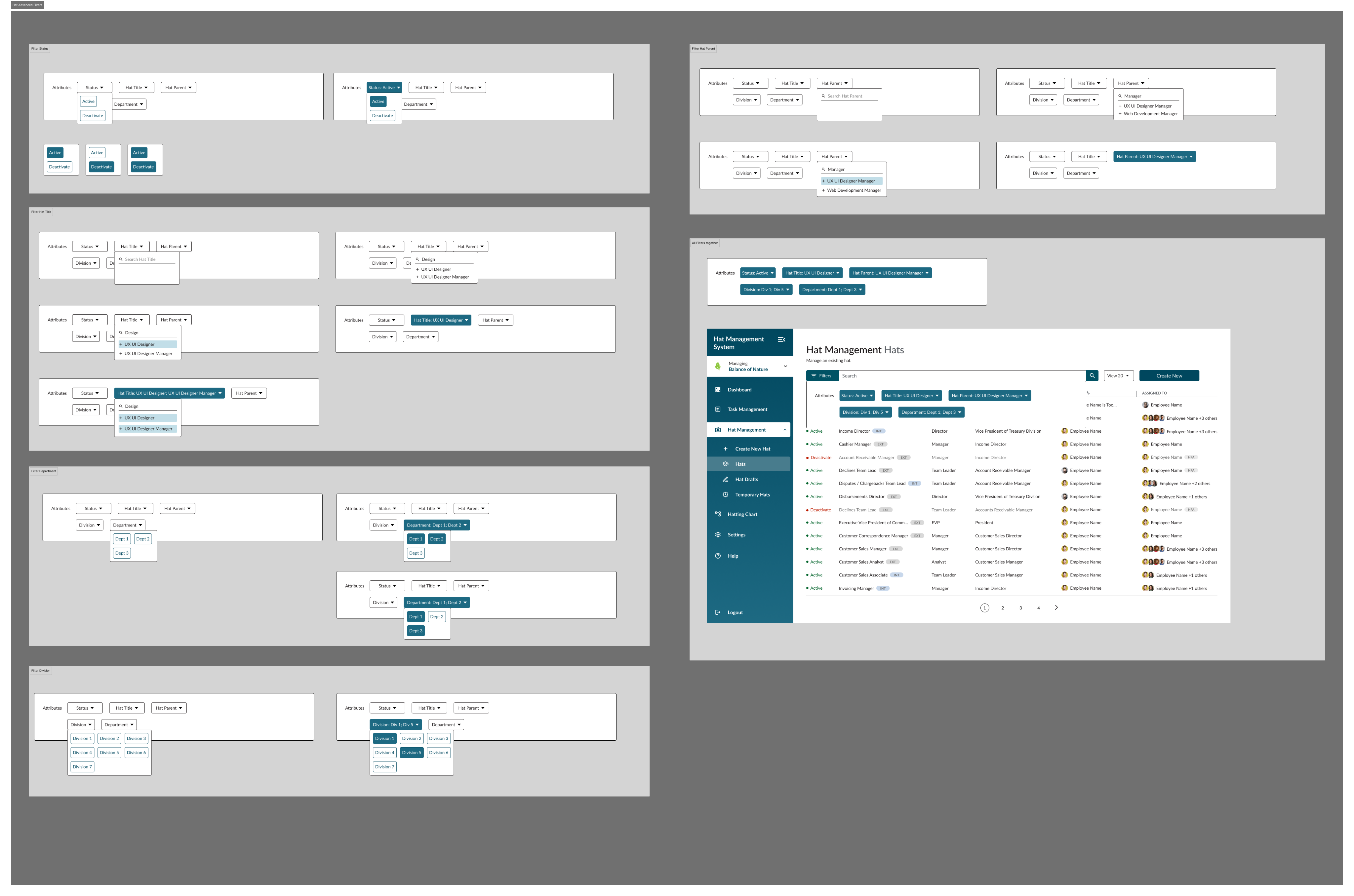
- Search feature with filters: Search and filter feature to allows users to find certain hats (roles)
- Hierarchy Views: Parent-child relationships visualized according to the Org Board and function divisions.
- Navigation: Logical menu grouping for fast access to divisions, departments, and units.
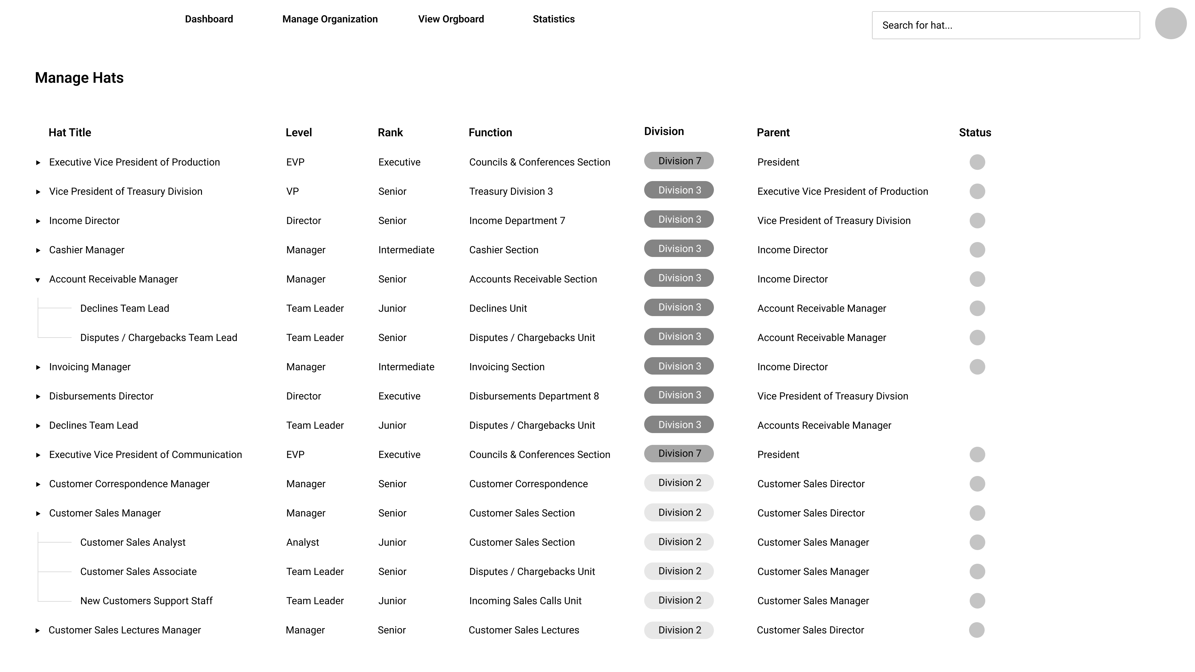
I was in charge of the lo-fi wireframes for the ‘Manage Hats’ screen.
I experimented with different layouts to ensure I developed an effective and user-friendly design.
In the end, I settled on a layout divided into sections, making it easy to access each row.
Design & Iteration
📃 Hi-Fidelity Designs
We showed the mid-fidelity wireframes to the stakeholders and the liked the designs. They liked the structure and how easy it was to view the hats (roles). They asked us to go straight into the hi-fidelity wireframes, and once we hade the hi-fi wireframes completed and approved by them, we would do some usability testing.
The lo-fi wireframes began evolving into mid-fi versions.
The mid-fi wireframes incorporated branding, features like filter and search functionality, and additional elements such as clear navigation, interactive buttons, and organized content sections to improve usability.
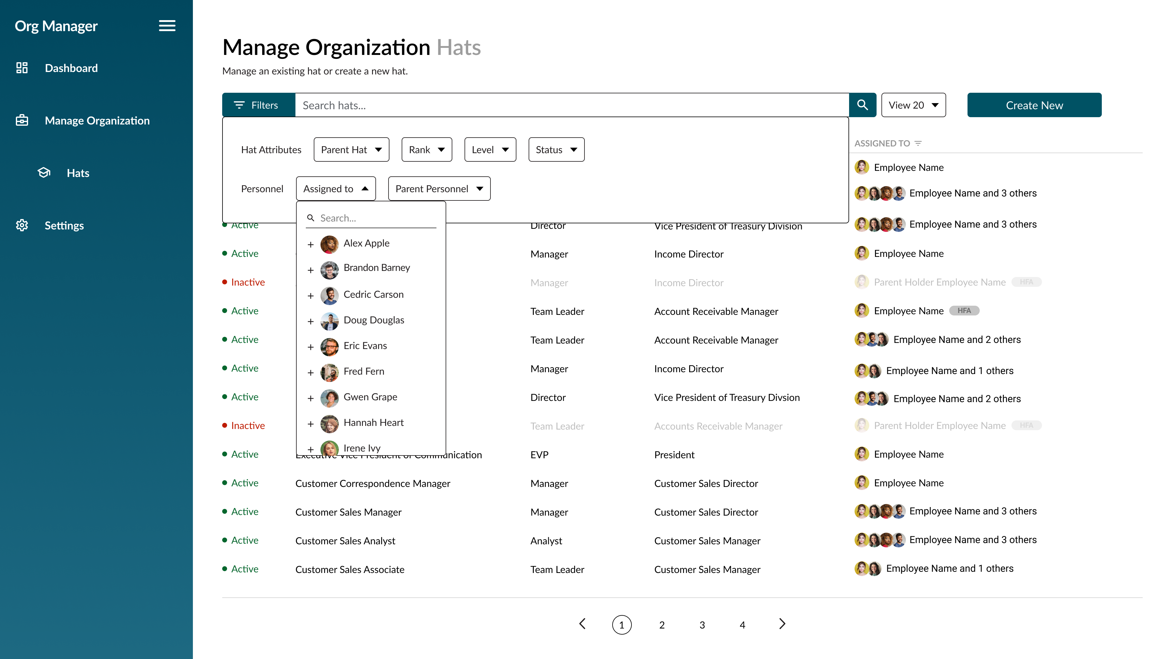
I decided to focus on creating an advanced filter feature, since the user’s main goal here is to search for specific hats.
Final Designs
With the high-fidelity wireframes completed and approved, we did some light usability testing. This included asking managers and HR staff to walk through core tasks like creating a new hat, reassigning roles, and searching for employees. The goal was to catch usability issues early validate that the flows made sense, and make sure that the interface felt intuitive before moving into final designs and development.
Feedback That Shaped The Final Design
- Added clearer labels on hat details
- Improved the visibility by spacing the list items
- Adjusted spacing and typography for better readability
- Changed the search and filter controls for better search function
From mid-fi to hi-fi, I incorporated feedback from the Product Owners and Business Analyst, refining the tags, updating the sidebar navigation, and adjusting other content as well.
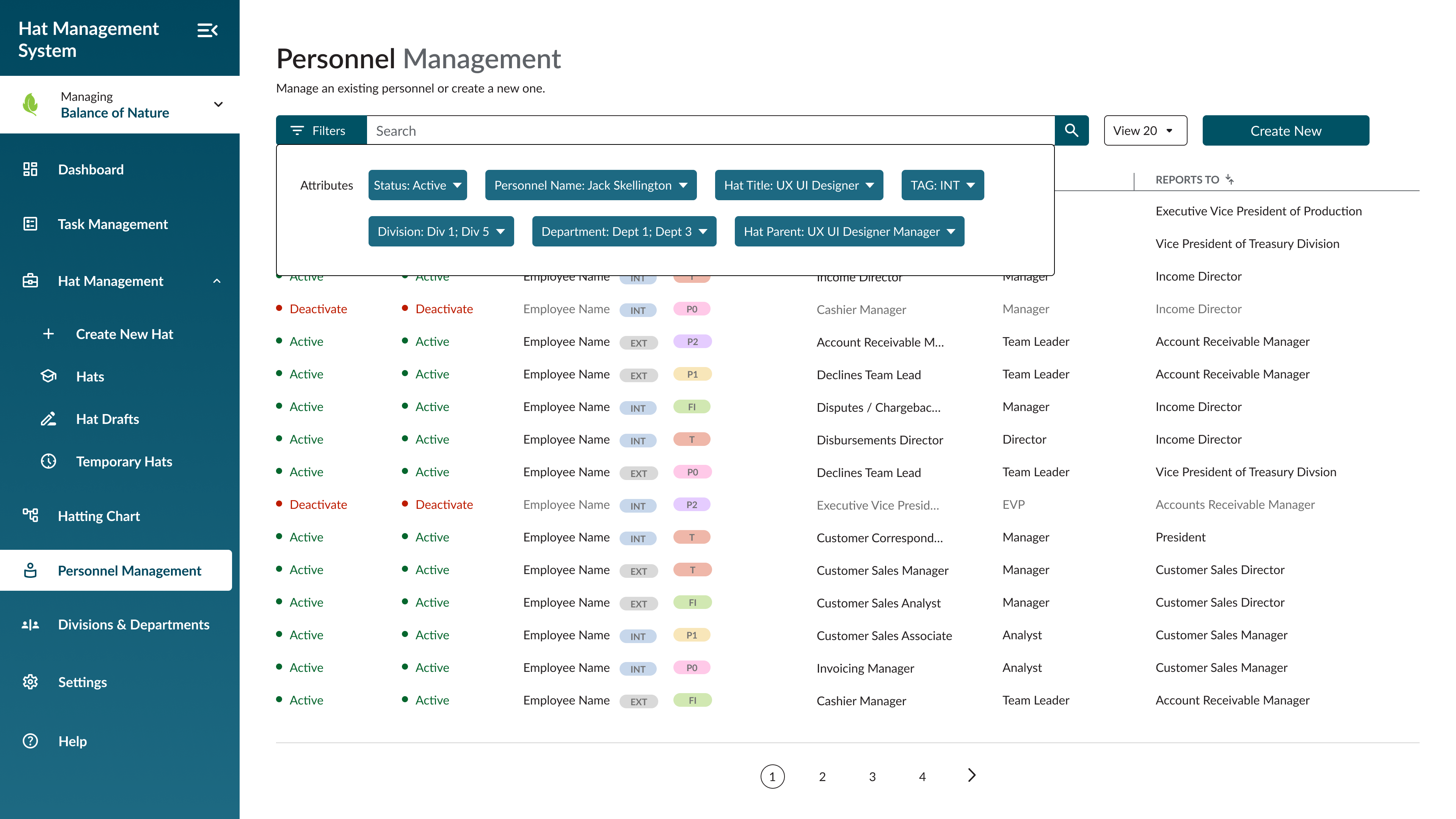
The search and filter feature was robust, allowing users to easily find any hat or person.
Handoff
🤝 It’s Time
After finalizing the design conducting usability testing, I handed off all screens, design system specs, and interaction notes to the developers. I worked closely with them to make sure everything was implemented as intended and stayed on standby for any questions along the way.
During the hand-off, I ensured that complex features were clearly explained so that nothing was left as a mystery.
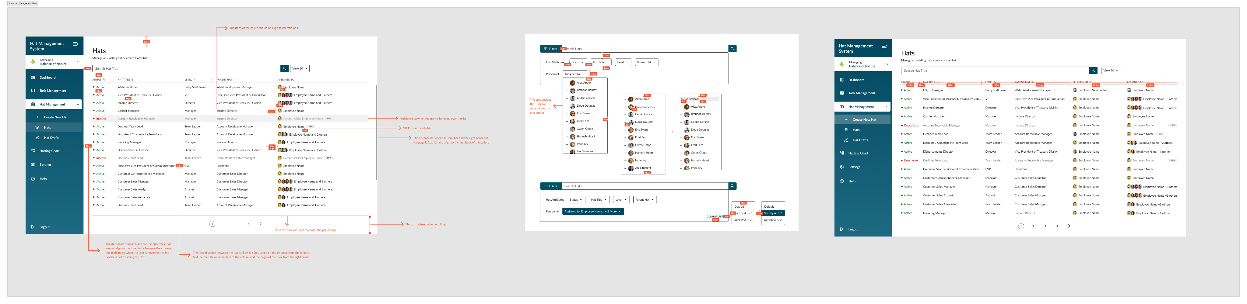
Detailed notes were provided for full screens wherever necessary to ensure clarity and smooth hand-off.
Impact & Learnings
🎇 Impact
The redesign of some of the key Comm Program features improved efficiency and engagement across multiple departments. Managers could quickly scan prioritize urgent CSWs, staff workers felt like they were being seen and heard. Redesigned forms reduced errors and streamlined workflows, saving time for both staff and managers. Establishing a design system ensured consistency across screens and laid the foundation for future scalability.
Learnings
Some stuff that I learned from this project were:
- User-centered research — Understanding real workflows and pain points helped make design decisions.
- Testing — Validating ideas at mid-fi and hi-fi stages prevented costly mistakes later.
- Collaboration — Close work with stakeholders, developers, and other designers ensured alignment and smooth handoff.
- Design systems — Building reusable components early not only improves consistency but also speeds up future updates.
Overall, I learned that thoughtful design paired with clear communication and iteration can transform complex designs into efficient, user-friendly products.

Raul @2025
jraul2723@gmail.com
Navigation
Home + Work
About Me + Contact
Creative Space
Resume
Projects
Comm Program
HMS Software
DHC Website
Rasu AI
90 Day App
Design System
Raul. J
Home + Work
About Me + Contact
Creative Space
Resume
Hat Management System (HMS)
Building an Interface that Helps locate and Manage Employees
Project Type
Work Management Software
Role
UX/UI Designer + UX Research
Industry
Workforce Management / HR Tech
Introduction
🖥️ The Product
The Hat Management System (HMS) is an internal tool for managers and staff to handle employee positions, task assignments, and promotions. The goal of this product is to organize position management, make it easy to view hats (roles), and provide clear info of employees and managers roles and tasks. They also wanted to intergate a new
👥 The Users
Internal team members, and executives/mangers who need transparency over ongoing initiatives, status updates, and performance indicators.
🏆 Business Goals For Product
Increase productivity by giving managers and staff workers that ability to easily view their CSW’s and submit CSW’s and Order forms. We want to close the feedback loop and improve team outcomes by making sure they see the CSW’s and work on them ASAP.
👨💻 What I Worked On
Hat Management Screen: I designed the Hats screen under the Hat Management dropdown. I created an inbox-style layout displaying a list of employees with their assigned hats, status indicators, and priority flags. This layout makes it easy for managers and HR to scan, track, and manage hat assignments efficiently.
Discovery & Research
⁉️ Kickoff Meeting
Since HMS is a brand-new system, our research focused on understanding existing workflows and identifying gaps. Another designer and I were briefed in by the Product Owner and Business Analyst on how the company wanted to manage positions, track all roles, and maintain visibility of each employee’s responsibilities for scenarios like promotions, role changes, or staff departures.
Interviews & Insights
Once we were updated on the business needs we wanted to collect more date from the user. We conducted user interviews across 7 departments to gather qualitative data on pain points and needs.
Key insights:
- Interviews: Managers, HR, and IT staff explained current pain points, including manual tracking, inconsistent access control, and lack of visibility.
- Workflow Analysis: Existing manual processes relied on Google Sheets and emails, causing errors and delays.
- Standards & Frameworks: Hubbard’s Organizing Board principles guided the hierarchy, parent-child relationships, and functions structure.
Key insights:
- Hats define positions, not employees; employees can wear multiple hats.
- Empty hats must be temporarily managed by the parent hat (Held From Above).
- Career paths require clear visualization of levels and expertise.
- Automation is critical for notifications, assignments, and access management.
User Flows and Mapping
To ensure the Hat Management System (HMS) met user needs, we started creating user flows and process maps for all critical tasks with the Business Analyst and the Product Owner. This helped visualize how managers, HR staff, and IT teams would interact with the system and highlighted areas where efficiency could be improved.
We started by creating a user flow for the hatting system to better understand its process.
We covered every scenario to ensure there was no confusion during the design process.
Defining The Problem
🤨 What is the problem?
After gathering research and analyzing feedback, one issue kept surfacing. User were losing track of CSW forms, the CSW forms are what are used to approve task and other important stuff. This gap wasn’t just an inconvenience, it was a breakdown that directly affected accountability, project progress, and team morale.
Exploring Solutions
✍️ Sketching and Wireframing
I started by sketching low-fidelity wireframes:
- Hat Management Screen: Inbox-style layout for employees and hats with status, priority, and easy assignment actions.
- Search feature with filters: Search and filter feature to allows users to find certain hats (roles)
- Hierarchy Views: Parent-child relationships visualized according to the Org Board and function divisions.
- Navigation: Logical menu grouping for fast access to divisions, departments, and units.
I was in charge of the lo-fi wireframes for the ‘Manage Hats’ screen.
I experimented with different layouts to ensure I developed an effective and user-friendly design.
In the end, I settled on a layout divided into sections, making it easy to access each row.
Design & Iteration
📃 Hi-Fidelity Designs
We showed the mid-fidelity wireframes to the stakeholders and the liked the designs. They liked the structure and how easy it was to view the hats (roles). They asked us to go straight into the hi-fidelity wireframes, and once we hade the hi-fi wireframes completed and approved by them, we would do some usability testing.
The lo-fi wireframes began evolving into mid-fi versions.
The mid-fi wireframes incorporated branding, features like filter and search functionality, and additional elements such as clear navigation, interactive buttons, and organized content sections to improve usability.
I decided to focus on creating an advanced filter feature, since the user’s main goal here is to search for specific hats.
Final Designs
With the high-fidelity wireframes completed and approved, we did some light usability testing. This included asking managers and HR staff to walk through core tasks like creating a new hat, reassigning roles, and searching for employees. The goal was to catch usability issues early validate that the flows made sense, and make sure that the interface felt intuitive before moving into final designs and development.
Feedback That Shaped The Final Design
- Added clearer labels on hat details
- Improved the visibility by spacing the list items
- Adjusted spacing and typography for better readability
- Changed the search and filter controls for better search function
From mid-fi to hi-fi, I incorporated feedback from the Product Owners and Business Analyst, refining the tags, updating the sidebar navigation, and adjusting other content as well.
The search and filter feature was robust, allowing users to easily find any hat or person.
Handoff
🤝 It’s Time
After finalizing the design conducting usability testing, I handed off all screens, design system specs, and interaction notes to the developers. I worked closely with them to make sure everything was implemented as intended and stayed on standby for any questions along the way.
During the hand-off, I ensured that complex features were clearly explained so that nothing was left as a mystery.
Detailed notes were provided for full screens wherever necessary to ensure clarity and smooth hand-off.
Impact & Learnings
🎇 Impact
The redesign of some of the key Comm Program features improved efficiency and engagement across multiple departments. Managers could quickly scan prioritize urgent CSWs, staff workers felt like they were being seen and heard. Redesigned forms reduced errors and streamlined workflows, saving time for both staff and managers. Establishing a design system ensured consistency across screens and laid the foundation for future scalability.
Learnings
Some stuff that I learned from this project were:
- User-centered research — Understanding real workflows and pain points helped make design decisions.
- Testing — Validating ideas at mid-fi and hi-fi stages prevented costly mistakes later.
- Collaboration — Close work with stakeholders, developers, and other designers ensured alignment and smooth handoff.
- Design systems — Building reusable components early not only improves consistency but also speeds up future updates.
Overall, I learned that thoughtful design paired with clear communication and iteration can transform complex designs into efficient, user-friendly products.

Raul @2025
jraul2723@gmail.com
Navigation
Home + Work
About Me + Contact
Resume
Projects
Comm Program
HMS Software
DHC Website
Rasu AI
90 Day App
Design System
Raul. J
Home + Work
About Me + Contact
Creative Space
Resume
Hat Management System (HMS)
Building an Interface that Helps locate and Manage Employees
Project Type
Product Design (Dashboard Feature)
Role
UX/UI Designer + UX Research
Industry
Workforce Management / HR Tech
Introduction
🖥️ The Product
The Hat Management System (HMS) is an internal tool for managers and staff to handle employee positions, task assignments, and promotions. The goal of this product is to organize position management, make it easy to view hats (roles), and provide clear info of employees and managers roles and tasks. They also wanted to include a new structure that allows hats (jobs, position or posts) be created and managed following a parent/child structure.
👥 The Users
The primary users of HMS are:
- Managers: Need to assign employees, review pending requests, and approve position changes efficiently.
- HR Staff: Track positions, and employee roles and what they do in for th company.
🏆 Business Goals For Product
HMS was built to achieve:
- Accurate Hat Management: Automate assignment, reassignment, and parent-child handling of hat (role).
- Efficiency: Have workflows for managers, HR, and IT teams.
- Visibility & Accountability: Provide real-time tracking of positions and approvals.
- Career Path Visualization: Display seniority, horizontal and vertical growth, and expert tracks per hat (role).
- Scalability & Integration: Connect with BoN systems (Comm Program, CRM) and third-party HR tools.
- Compliance & Logging: Maintain history and approval logs for auditing purposes.
👨💻 What I Worked On
Hat Management Screen: I designed the Hats screen under the Hat Management dropdown. I created an inbox-style layout displaying a list of employees with their assigned hats, status indicators, and priority flags. This layout makes it easy for managers and HR to scan, track, and manage hat assignments efficiently.
Discovery & Research
⁉️ Kickoff Meeting
Since HMS is a brand-new system, our research focused on understanding existing workflows and identifying gaps. Another designer and I were briefed in by the Product Owner and Business Analyst on how the company wanted to manage positions, track all roles, and maintain visibility of each employee’s responsibilities for scenarios like promotions, role changes, or staff departures.
Interviews & Insights
Once we were updated on the business needs we wanted to collect more date from the user. We conducted user interviews across 7 departments to gather qualitative data on pain points and needs.
Key insights:
- Interviews: Managers, HR, and IT staff explained current pain points, including manual tracking, inconsistent access control, and lack of visibility.
- Workflow Analysis: Existing manual processes relied on Google Sheets and emails, causing errors and delays.
- Standards & Frameworks: Hubbard’s Organizing Board principles guided the hierarchy, parent-child relationships, and functions structure.
Key insights:
- Hats define positions, not employees; employees can wear multiple hats.
- Empty hats must be temporarily managed by the parent hat (Held From Above).
- Career paths require clear visualization of levels and expertise.
- Automation is critical for notifications, assignments, and access management.
User Flows and Mapping
To ensure the Hat Management System (HMS) met user needs, we started creating user flows and process maps for all critical tasks with the Business Analyst and the Product Owner. This helped visualize how managers, HR staff, and IT teams would interact with the system and highlighted areas where efficiency could be improved.
We started by creating a user flow for the hatting system to better understand its process.
We covered every scenario to ensure there was no confusion during the design process.
Defining The Problem
🤨 What is the problem?
After doing some interviews and collecting data, we learned that the challenge was to design an interface that makes managing a complex organization feel simple, really simple. The system needed to let users create and assign hats (roles), manage parent-child hierarchies, connect with other internal and HR tools, and give a clear view of career paths and expertise levels, we had to take a complex idea and make it simple.
Exploring Solutions
✍️ Sketching and Wireframing
I started by sketching low-fidelity wireframes:
- Hat Management Screen: Inbox-style layout for employees and hats with status, priority, and easy assignment actions.
- Search feature with filters: Search and filter feature to allows users to find certain hats (roles)
- Hierarchy Views: Parent-child relationships visualized according to the Org Board and function divisions.
- Navigation: Logical menu grouping for fast access to divisions, departments, and units.
I was in charge of the lo-fi wireframes for the ‘Manage Hats’ screen.
I experimented with different layouts to ensure I developed an effective and user-friendly design.
In the end, I settled on a layout divided into sections, making it easy to access each row.
Design & Iteration
📃 Hi-Fidelity Designs
We showed the mid-fidelity wireframes to the stakeholders and the liked the designs. They liked the structure and how easy it was to view the hats (roles). They asked us to go straight into the hi-fidelity wireframes, and once we hade the hi-fi wireframes completed and approved by them, we would do some usability testing.
The lo-fi wireframes began evolving into mid-fi versions.
The mid-fi wireframes incorporated branding, features like filter and search functionality, and additional elements such as clear navigation, interactive buttons, and organized content sections to improve usability.
I decided to focus on creating an advanced filter feature, since the user’s main goal here is to search for specific hats.
Final Designs
With the high-fidelity wireframes completed and approved, we did some light usability testing. This included asking managers and HR staff to walk through core tasks like creating a new hat, reassigning roles, and searching for employees. The goal was to catch usability issues early validate that the flows made sense, and make sure that the interface felt intuitive before moving into final designs and development.
Feedback that shaped the final design
- Added clearer labels on hat details
- Improved the visibility by spacing the list items
- Adjusted spacing and typography for better readability
- Changed the search and filter controls for better search function
From mid-fi to hi-fi, I incorporated feedback from the Product Owners and Business Analyst, refining the tags, updating the sidebar navigation, and adjusting other content as well.
The search and filter feature was robust, allowing users to easily find any hat or person.
Handoff
🤝 Handoff Time
After finalizing the designs I prepared the hand-off page for the developers. The page included the screens with annotated comments, component specs, and other notes that made it easy for developers to understand the designs, flows, and functionality of the designs and features.
During the hand-off, I ensured that complex features were clearly explained so that nothing was left as a mystery.
Detailed notes were provided for full screens wherever necessary to ensure clarity and smooth hand-off.
Impact & Learnings
🎇 Impact
The inbox-style screen allows managers and HR staff to quickly scan, find employees, and track hats with ease. There is now a clear view and expertise levels are now clearly visualized Finally.
Learnings
Designing a complex organizational interface from scratch required thorough research, strong stakeholder alignment, and iterative testing. I learned that having a clear structures is essential for usability and adoption.

Raul @2025
jraul2723@gmail.com
Navigation
Home + Work
About Me + Contact
Resume
Projects
Comm Program
HMS Software
DHC Website
Rasu AI
90 Day App
Design System